WEEK 7: PROGRESS OF EAOT & THE PROFESSIONAL (3)
- Evon Liew

- Feb 28, 2021
- 2 min read
Updated: Mar 4, 2021
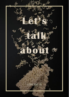
1. EAOT (Everything About One Thing)
After comments and suggestions on the cover, I retouched and embellished, and I also made the back echo the front, which is more in line with the characteristics of the instant noodles. Later, I type and design the content, there are pages to read easily on the bottom with center alignment of each subject. In addition to the form of a paragraph, I also divide the text into different columns on the basis of related themes in order to increase the sense of reading. Then, I inserted the photos I took earlier in the article to make the content more three-dimensional without making them tired of reading. I'm trying to make the photo a little bigger, so that the reader can see it more clearly. Next, I'm also going to draw some illustrations about the noodles to make the text more cute and vivid.


2. The Professional
My lecturer said that my logo was uncoordinated, and the pattern could be improved, so I adjusted it. Then I also changed the color and design of the personal CV, because he told me that I could choose better colors and bring out my own style. In the end, I chose beige with a golden yellow color. This color makes me feel more advanced and more comfortable to look at. After that, I made my own business card, conveying the concept that I am a designer, and the colors are beige and blue, because the color combination of these two are my favorite colour. I put my name and my look on the front so that everyone can see it at a glance. Moreover, I put my logo and the contact information on the back. The design is more pleasurable and free to express my personality and character. I also designed a business card holder to make it easy to install a business card and take it with me. In addition, I have also designed an envelope with a cover letter so that the person in charge can prepare it in advance and understand it more quickly. For the personal brand identity part, I used to take notes and records, so I designed a book that could be used as a memo. The color of the cover is blue, which I prefer, so that people can get a better understanding of me. Furthermore, I designed cute stickers for my theme, including my logo, name, slogan, and favorite patterns. The reason I'm designing stickers is because I've liked to collect stickers since I was a kid, and then put my favorite stickers on my favorite books and use this concept to complete this work. I can stick it on my item too, so that others will know that it belongs to me. I will also stick my slogan in places that I often see, remind myself of the purpose and direction of being a designer, so that I don't get lost.
Logo


Personal CV & Mailer


PERSONAL BRAND IDENTITY


Comments