WEEK 6: PROGRESS OF EAOT & THE PROFESSIONAL (2)
- Evon Liew
- Feb 22, 2021
- 1 min read
1. EAOT
I designed the cover of the magazine and set a title for it after the last typesetting. At the same time, I designed several different covers, and then later remodeled them. To make the whole more complete, I have changed the content and added some fresh topics. I put the colour of the design of the menu page simple or not too complicated because I want to bring out a stylish and single style.
Cover page:


Menu:


In addition, I want to add to the magazine some quick-face close-ups and images, so I bought them for shooting, and then selected appropriate ones to put them in to match the content that can attract the attention of readers and want to continue reading. To make the font more vivid, I also selected a noodle font to match my theme. Next, based on the content I wanted to describe, I also bought several popular instant noodles and took photos while studying. It was a really fun process and I enjoyed it too.
Photos:


2. The Professional
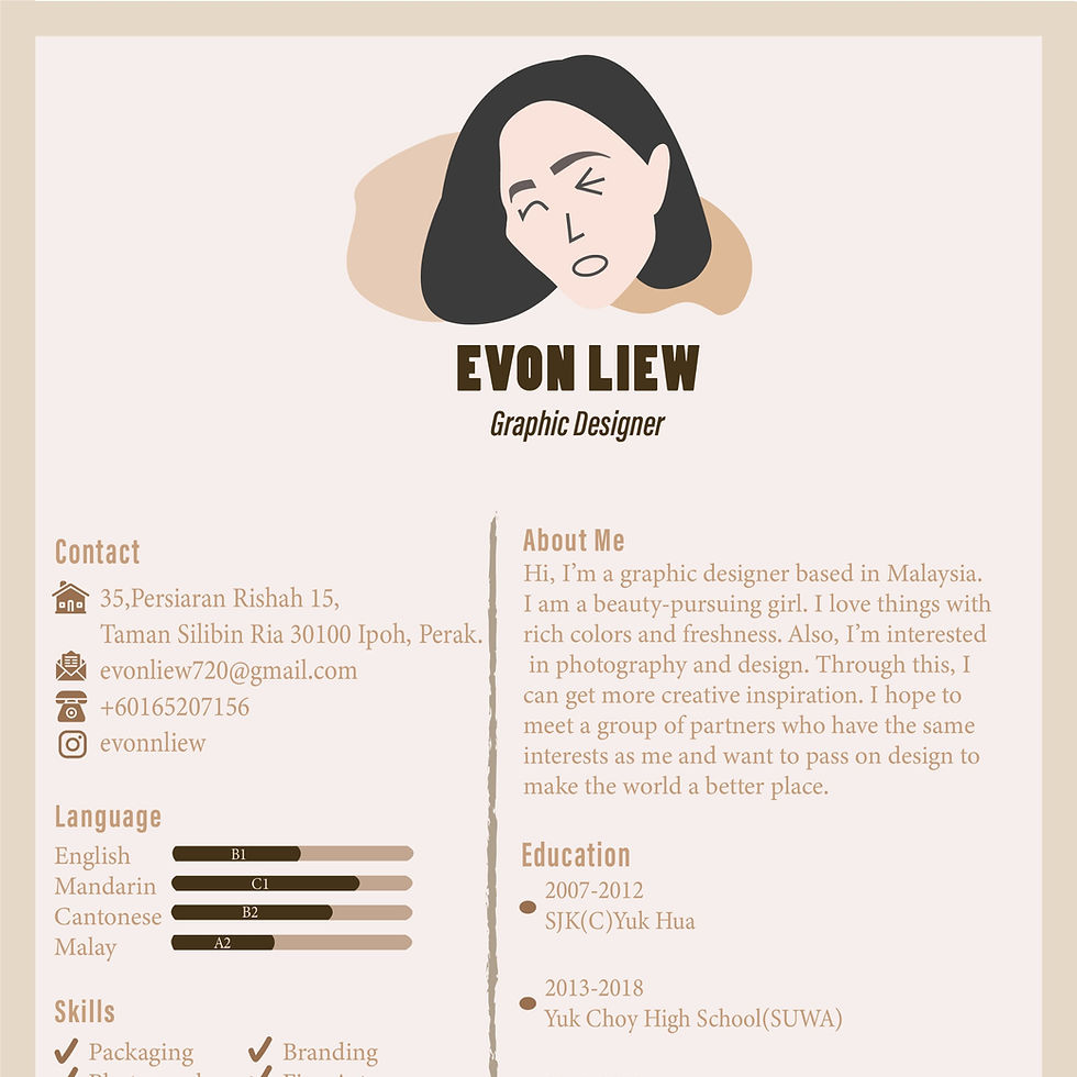
I started to draw up the layout of the personal cv after designing the logo. I chose a pink one to let the company know that the interviewer is a girl. Then I also used the brush element to express my joy and innocent character and personality.
Personal CV:


Comments