WEEK 11: INFOGRAPHIC FINAL OUTCOME
- Evon Liew

- Jul 15, 2020
- 1 min read
Updated: Jul 24, 2020
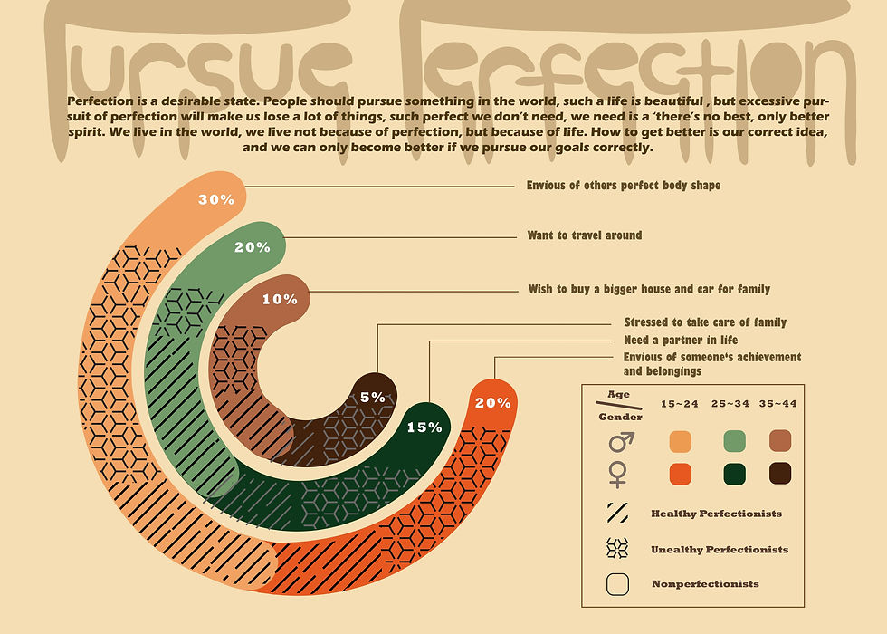
I made color and shape adjustments to make the visual effect better and give people an easy-to-understand feeling. I also added a description to explain what I want to express and the purpose of making this topic, so that the audience can understand more clearly, and also can learn what I want to express through this chart.

Comments