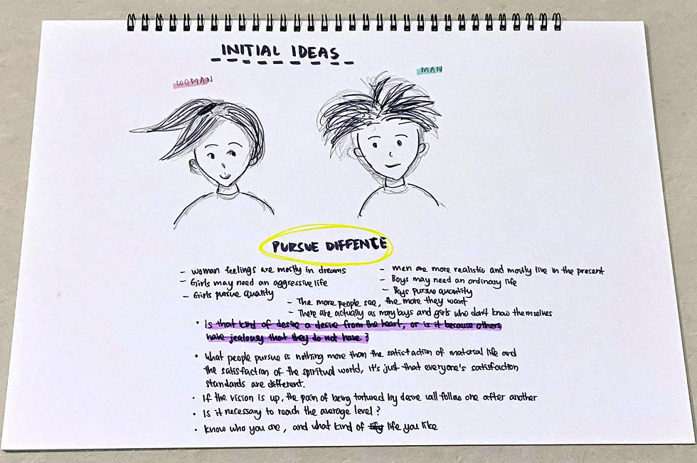
This is based on the graphics I drew and adjusted. I can see from the chart that the problems faced by different ages and genders, and whether their psychological pursuits and goals are at a healthy level. In addition, these data are collected from the survey, and then made the statistics.
Areas for improvement:
- Title can become more interesting and compelling, and its color is better related to the background
- Adjust the density and size of the font, font type
- The shape of the icon becomes the same, do not differ in density and size


Comments